Études Studio
One-month website redesign for Études Studio, a luxury fashion house, focused on the sales funnel UX across desktop, tablet and mobile, without diluting the brand’s art direction.
What we had to solve
Luxury brand standards
Every screen had to feel unmistakably Études: editorial photography, restrained UI, generous space. Conversion patterns couldn’t look like mass-market e-commerce.
Art direction as a hard constraint
The DA already defined the visual world. UX proposals had to fit inside that frame, typography, hierarchy and CTAs refined, not reinvented against the brand.
Funnel clarity under pressure
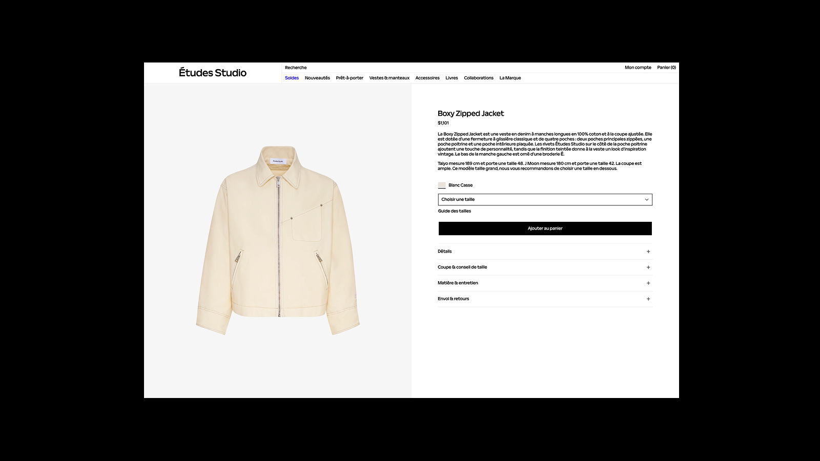
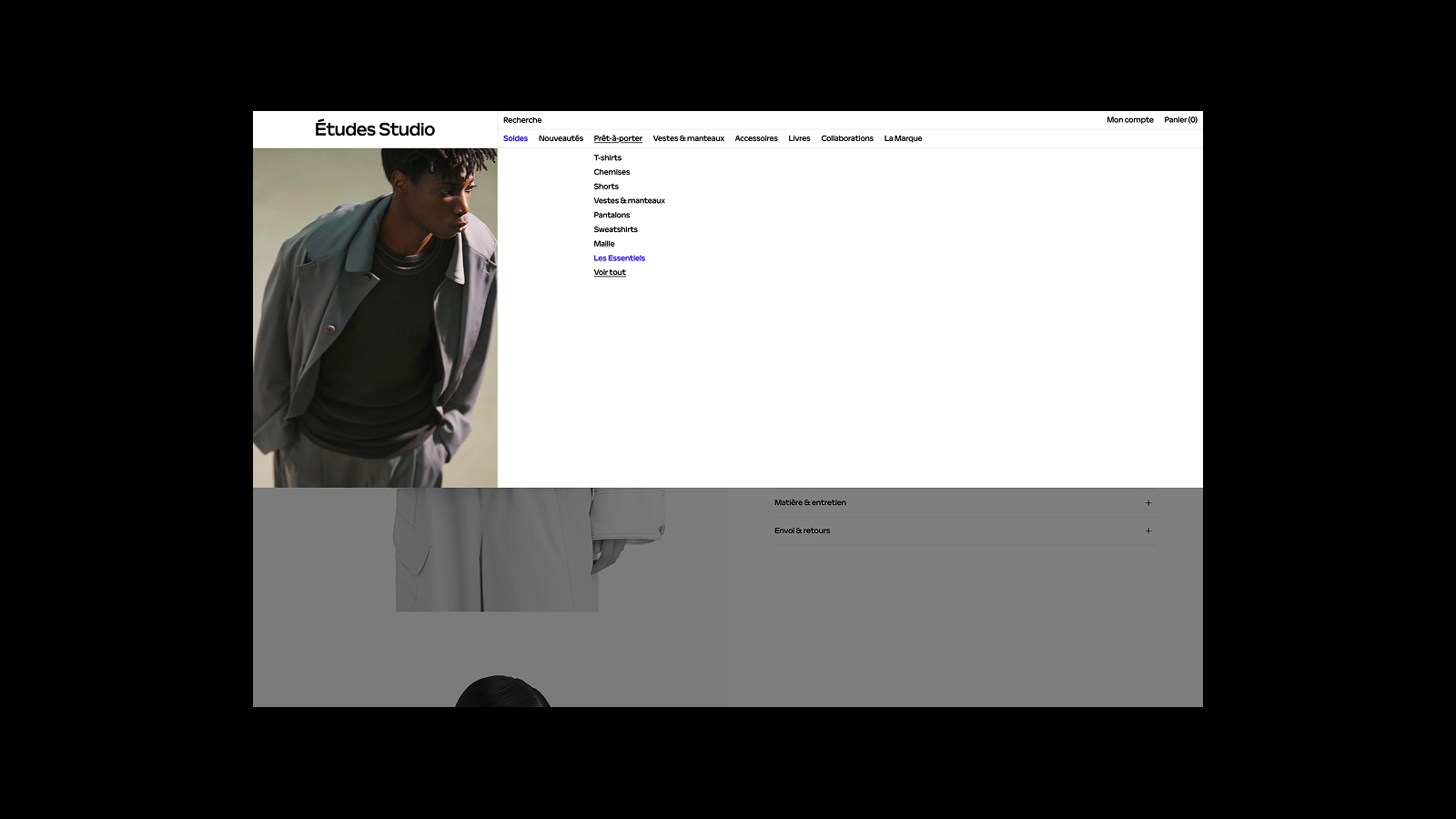
From mega-menu discovery to PDP and add-to-cart, the path needed fewer hesitations: size selection, product info architecture and mobile stacking without losing the luxury feel.
How we got there
- 01
Audit
Reviewed the live funnel, navigation, PLP, PDP, cart entry, and flagged friction against brand and conversion goals on desktop, tablet and mobile.
- 02
Proposal
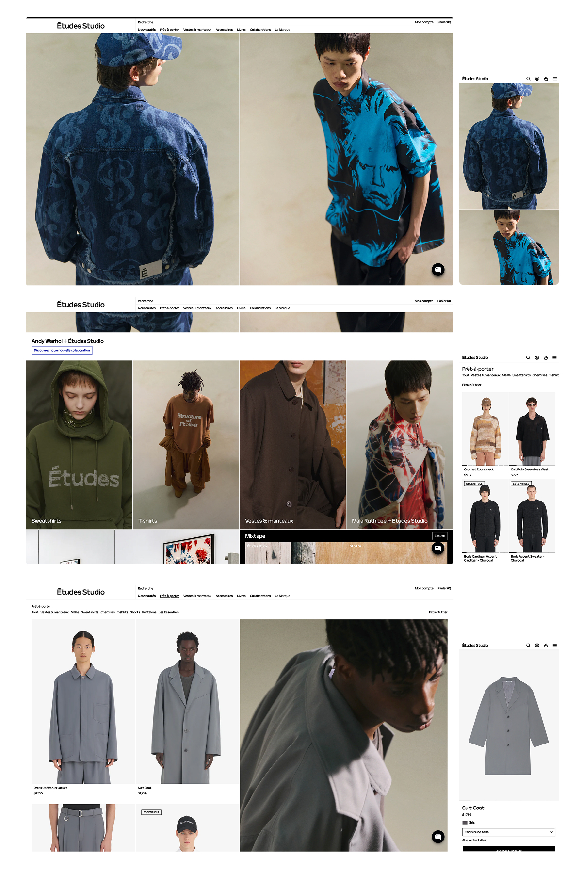
Delivered a focused redesign propal: information architecture, responsive grids, mega-menu behaviour and PDP structure aligned with the existing art direction.
- 03
UX craft
Designed key templates, home, category, product, with clear size selection, accordion details and a high-contrast add-to-cart CTA that still feels premium.
- 04
Responsive handoff
Specs and breakpoints for desktop, tablet and mobile so engineering could ship the funnel consistently within the brand system.
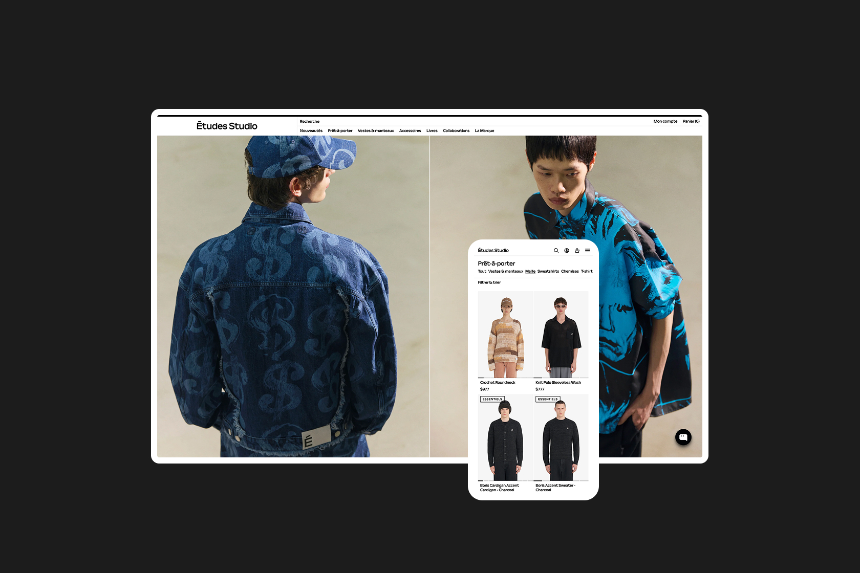
What changed
A calmer, sharper purchase path that protects Études Studio’s luxury image while making discovery and add-to-cart more direct across every viewport.